How to stop the spread of illness with the internet of things
highlights
A real–time map of human health
Communicable illnesses like the flu are poorly tracked and come with serious risks to children and the immunodeficient population. What if you knew flu was going around and went to the doctor at the first sign of symptoms? Tamiflu and other treatments are available to head off complications if taken within the first 48 hours of contracting the virus. The gold standard flu report comes from the CDC on a multi–week delay. Our goal was to collect the data necessary to make a real-time early warning system.
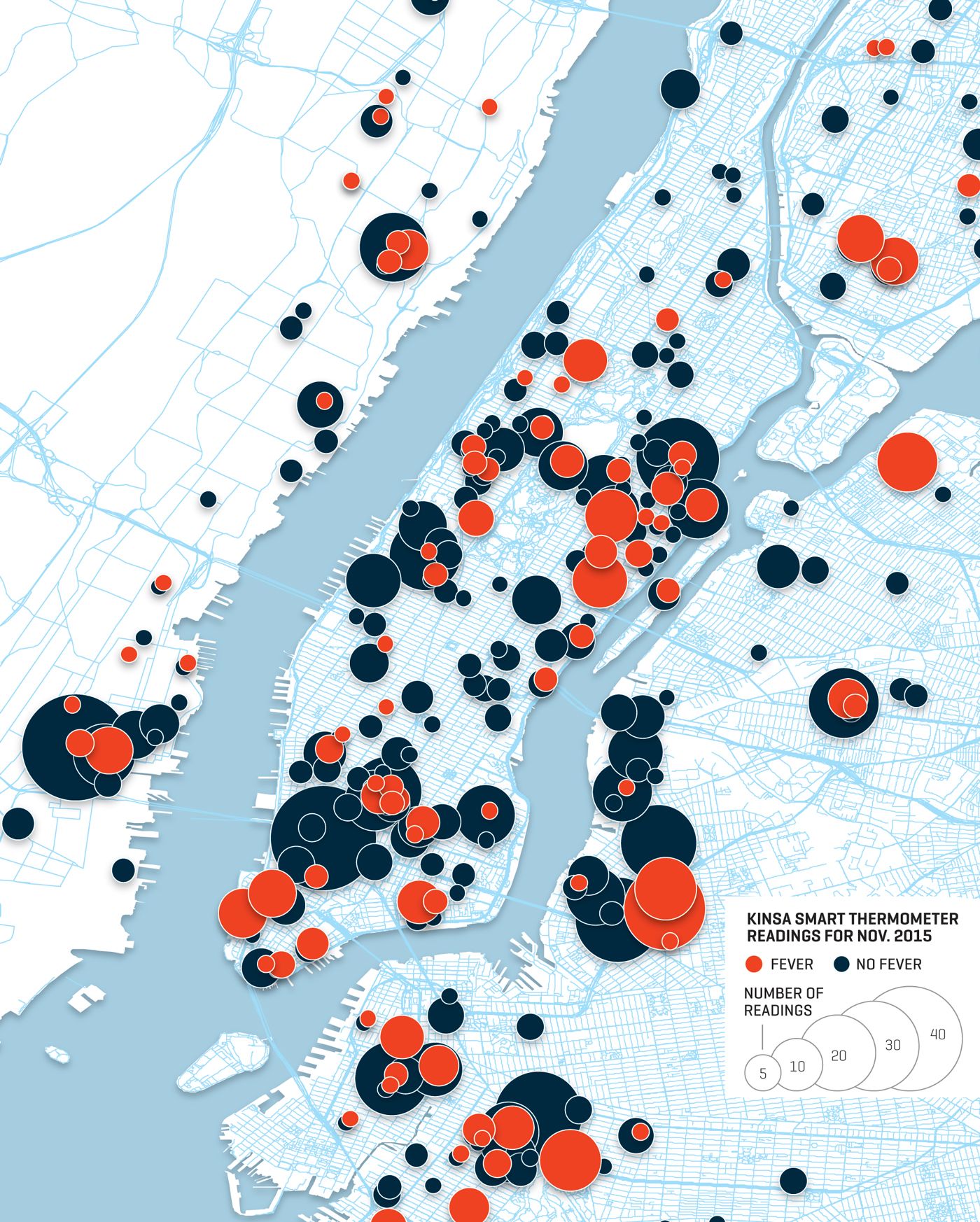
Graphic from Forbes article on Kinsa using real data from New York City
To gather the necessary data, Kinsa created the first smart thermometer. We took the device that parents reach for when they first suspect their child has fallen ill and turned it into a sensor network for population health. By gathering temperatures, symptoms, and location we could build a real-time map of human health.
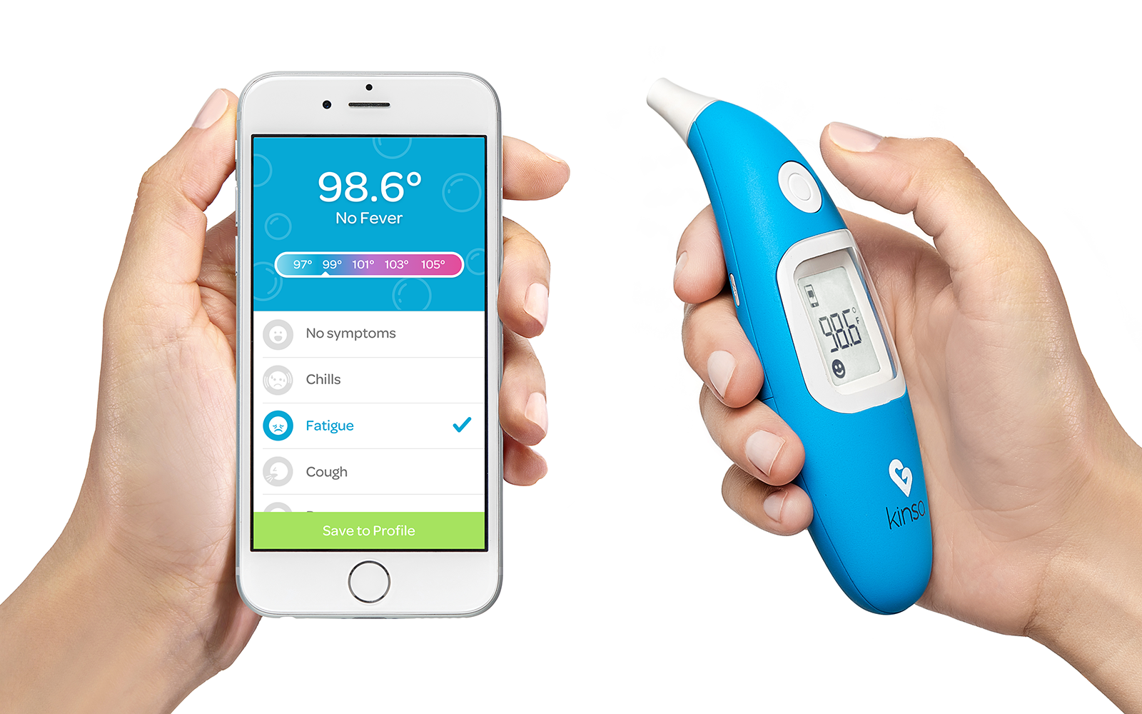
Kinsa thermometers connect with the app to save your health history and provide guidance when your fever is cause for concern.
I was primarily responsible for designing the Android and iOS applications. I also hired and mentored two designers and advised on hardware, packaging, and in–store product displays.
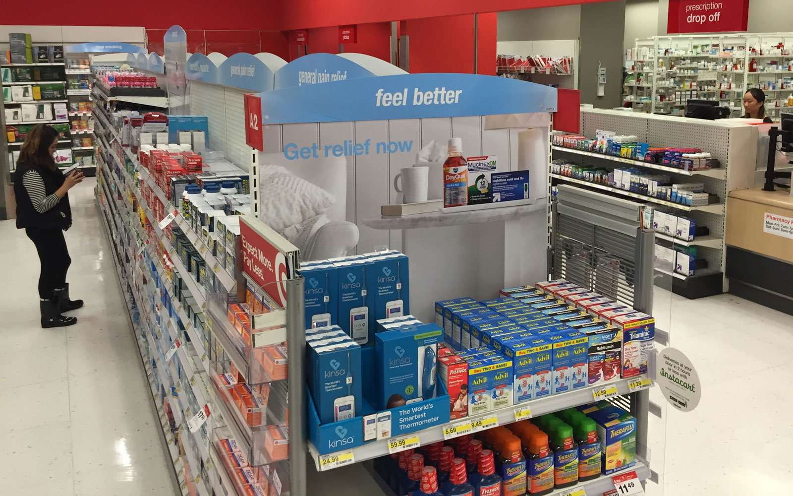
Kinsa is sold in Target, Apple, CVS, Babies"R"Us, and other stores
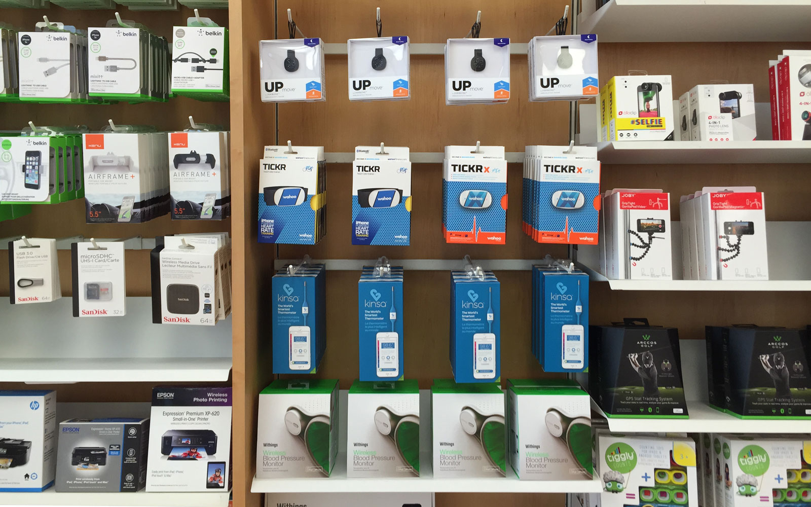
Kinsa in the Apple store
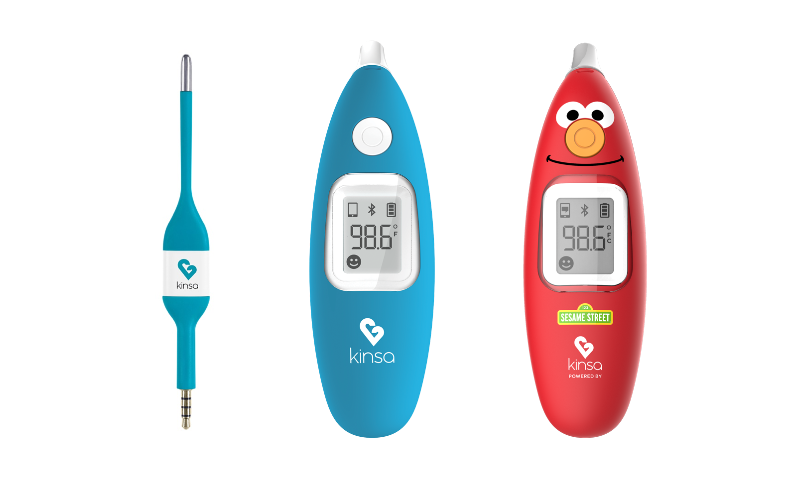
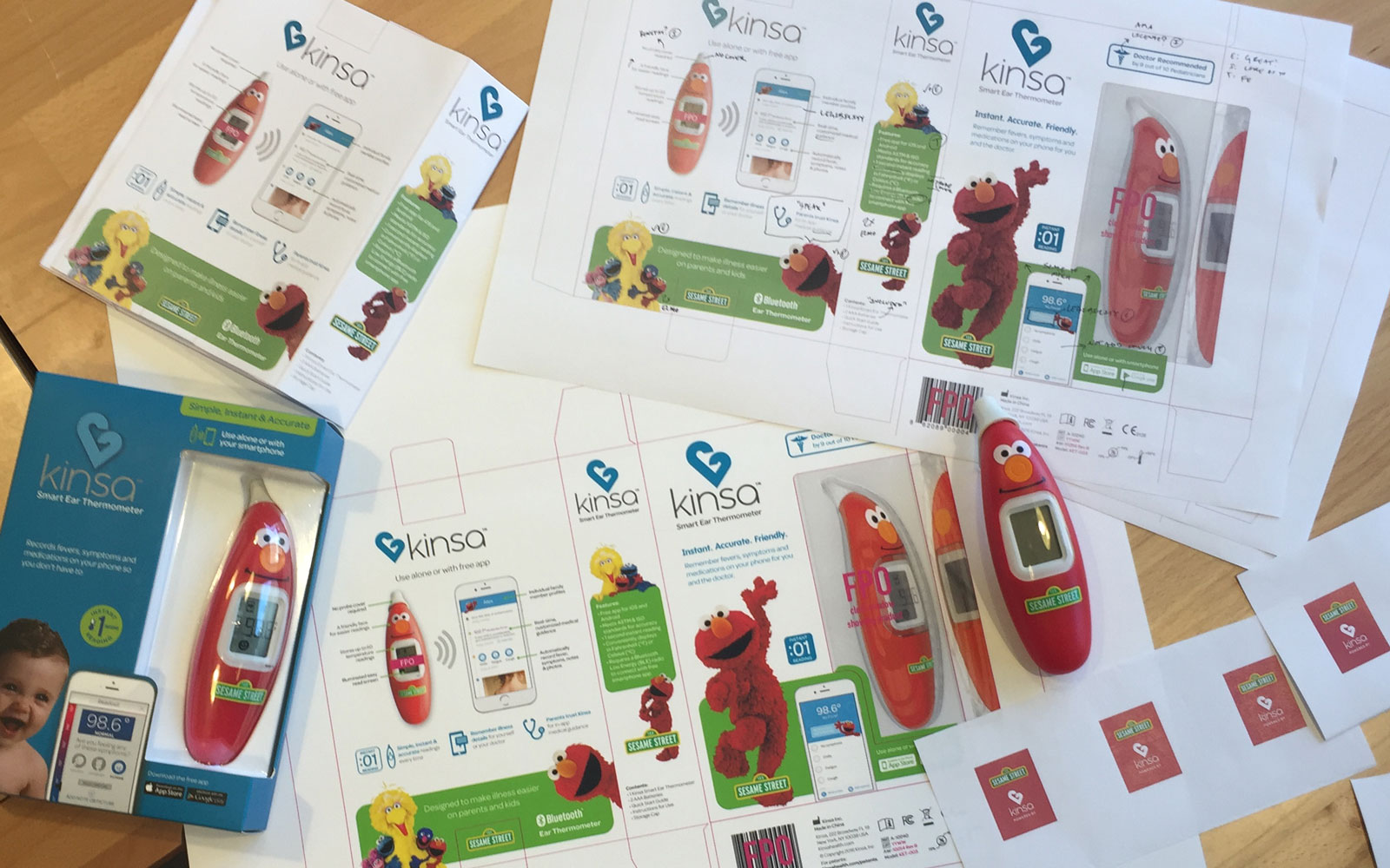
Kinsa’s thermometers: the original stick thermometer, a non-invasive bluetooth ear thermometer, and a new Elmo thermometer via a partnership with Sesame Street.
Working with Sesame Workshop was a ton of fun. The official Elmo voice actor supplied hundreds of lines of audio we used in the app to help kids smile when they were feeling ill. I worked with our design contractors to iterate on the packaging and industrial design.
User research
Since health data is especially sensitive, user research was key to building a connected product experience that met families’ privacy requirements while providing useful data for the community. We had hundreds of interviews with families both in the office and in their homes to ensure that we designed trust into our service.
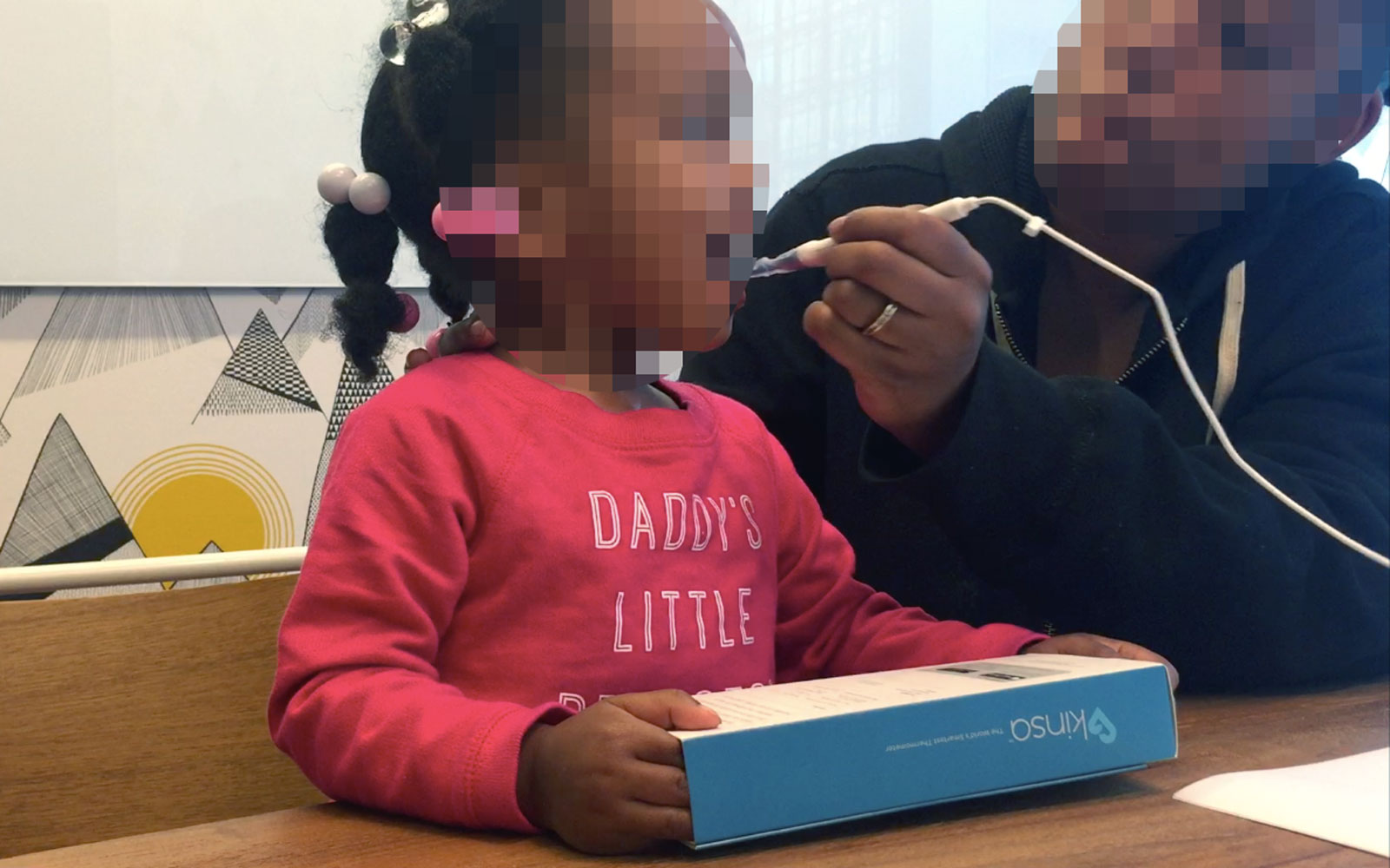
In–office unboxing and first–use testing
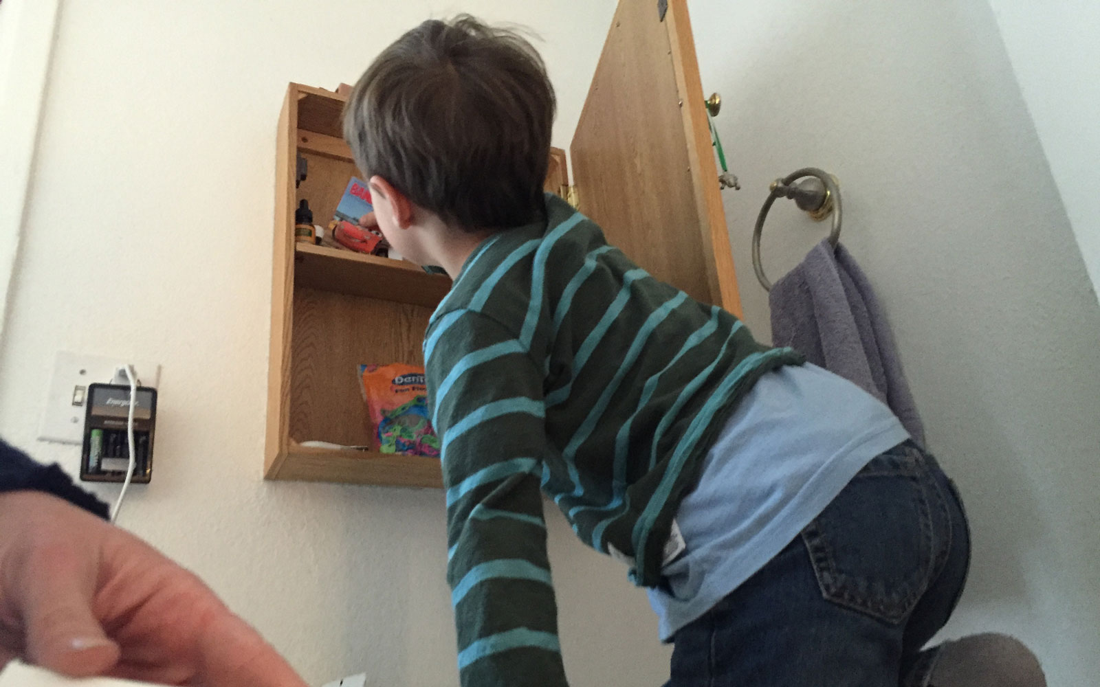
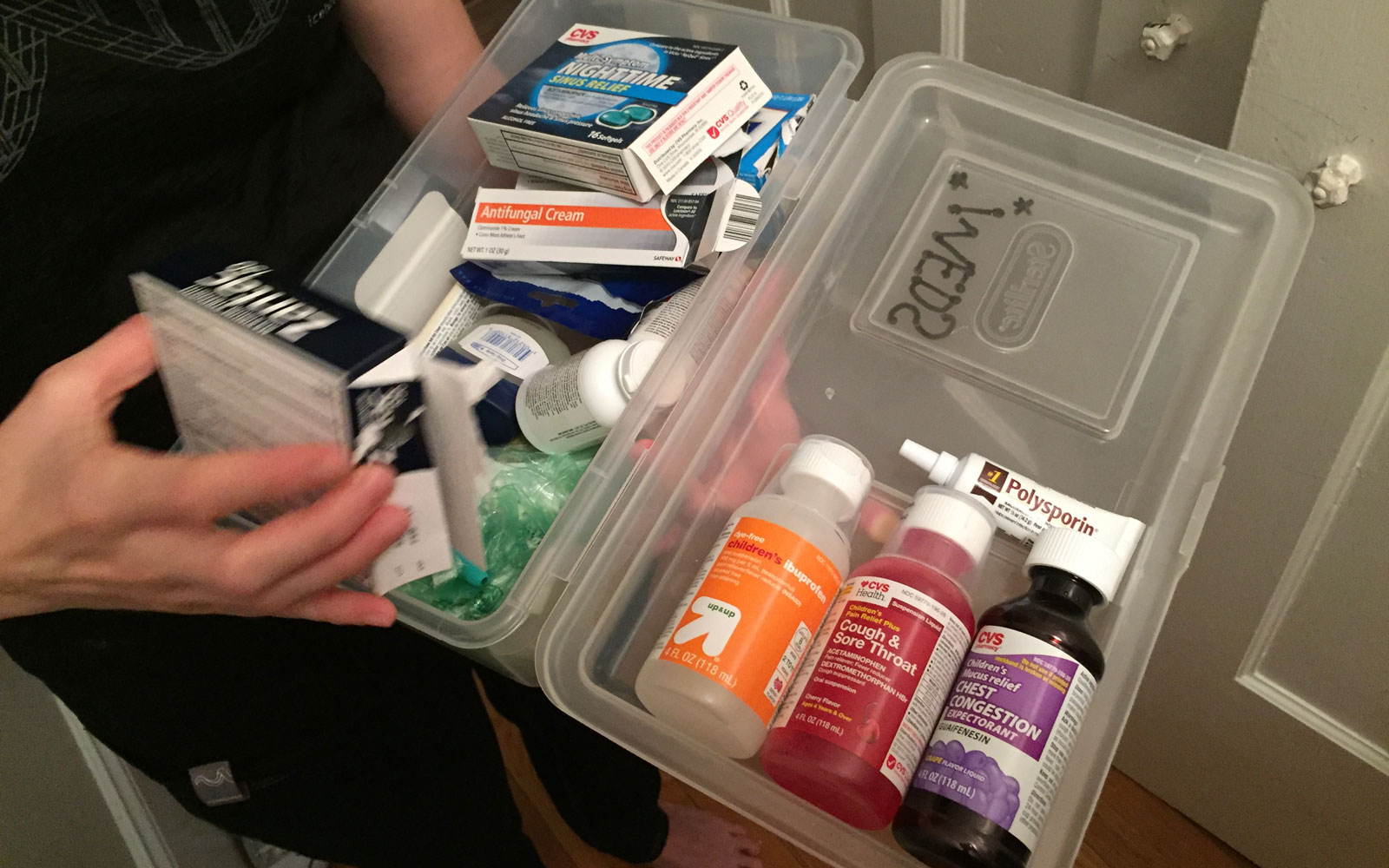
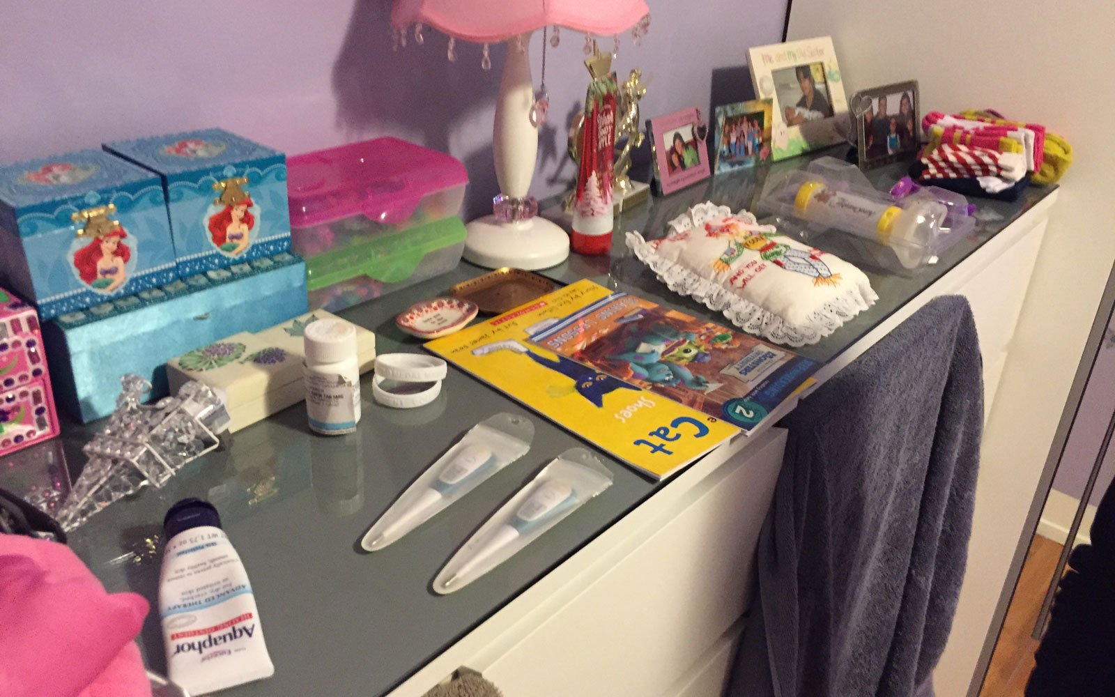
In–home contextual inquiry, opening up the medicine cabinet
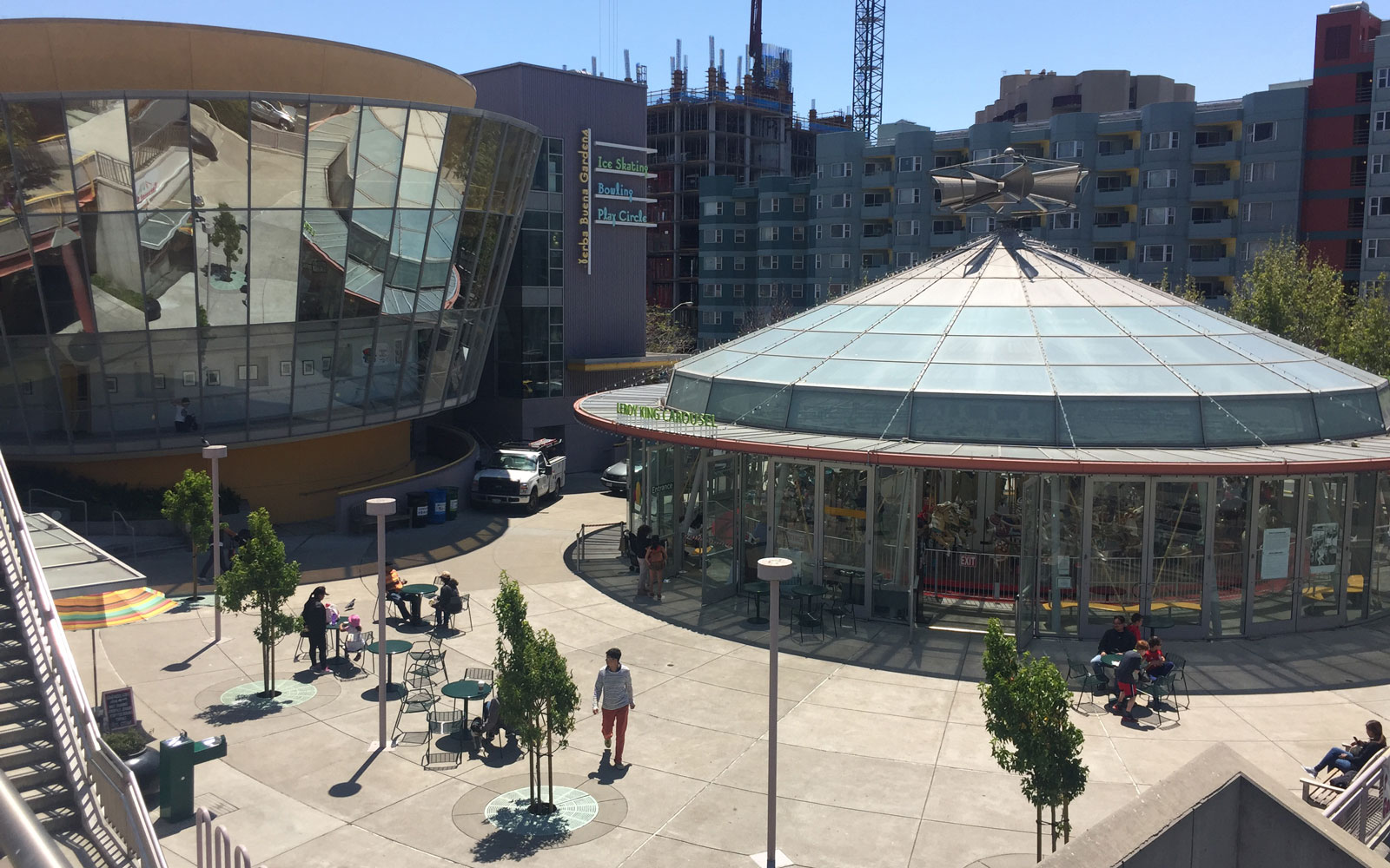
As a startup, we needed fast and free iterative research. I'd go the park or children’s museum with simple tests to get quick feedback from parents.
Cataloging insights is important and comes with some tradeoffs: do we need video of every interview? How do we share insights with the team? We created a master user insight spreadsheet organized by interview and held frequent debriefs.
Mobile process
During my tenure at kinsa we launched big updates to support new hardware like our bluetooth thermometer and Sesame Street integration as well as tons of small feature tests. The project I learned the most from was a total rewrite of the iOS app.
The primary goal was to pay off technical debt accumulated from the earliest versions of the app to increase the speed of development for new features. The product team took the opportunity to consider user experience updates based on our user research. We identified three focus areas: the temperature taking flow, navigation, and building a cohesive UI pattern library. This was way too much to focus on and taught the biggest lesson: pare down work into bite-sized chunks. We started by drawing whiteboard diagrams of user flows together. I iterated on blueprints, quickly sketched mockups, and communicated progress with the team.
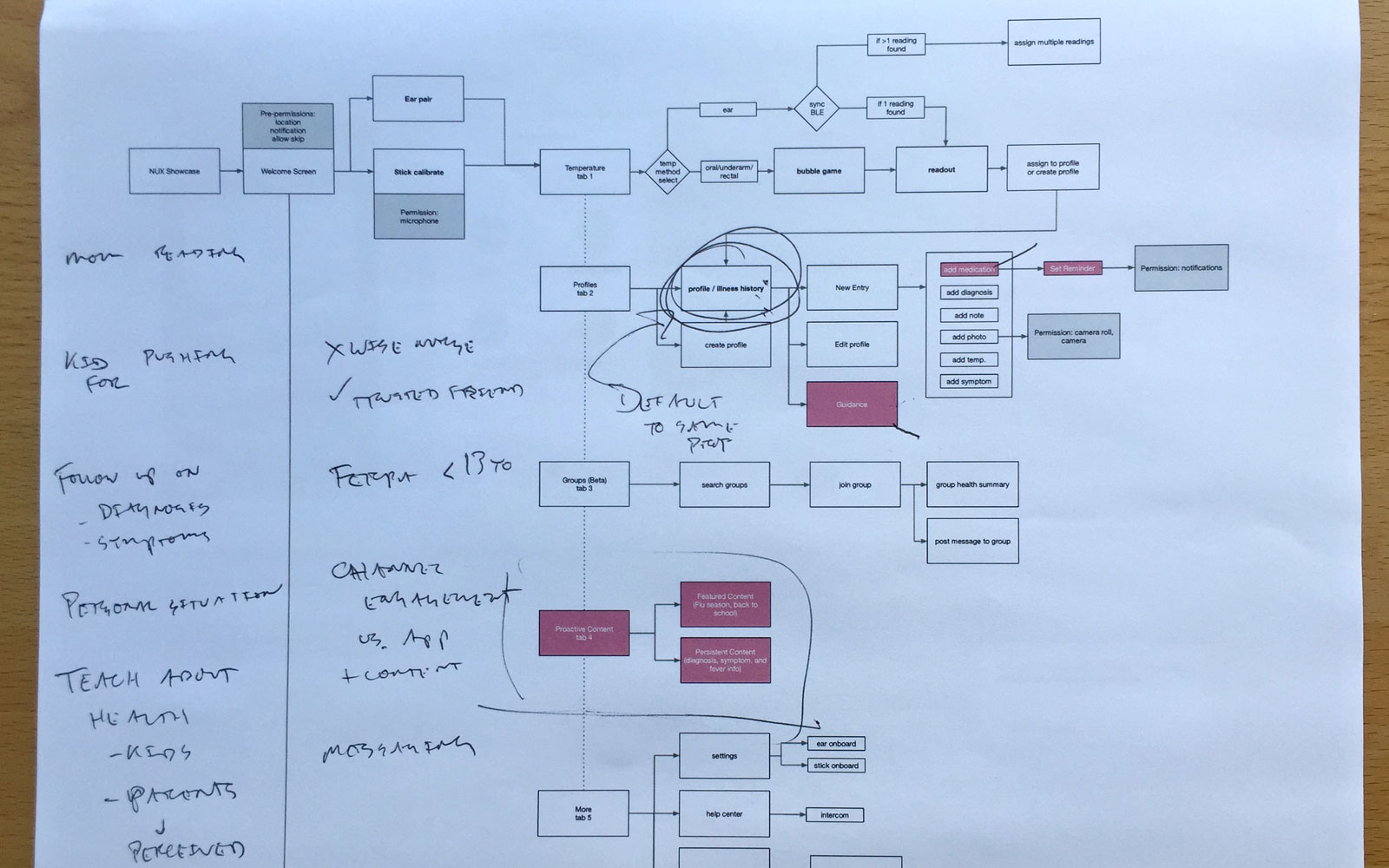
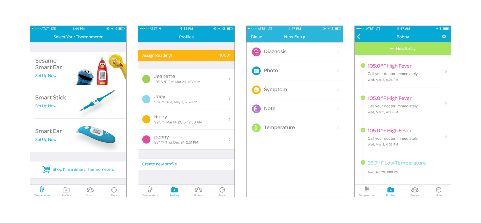
Changing to a tab navigation improved discoverability for users and made it simpler to chunk out features for engineering.
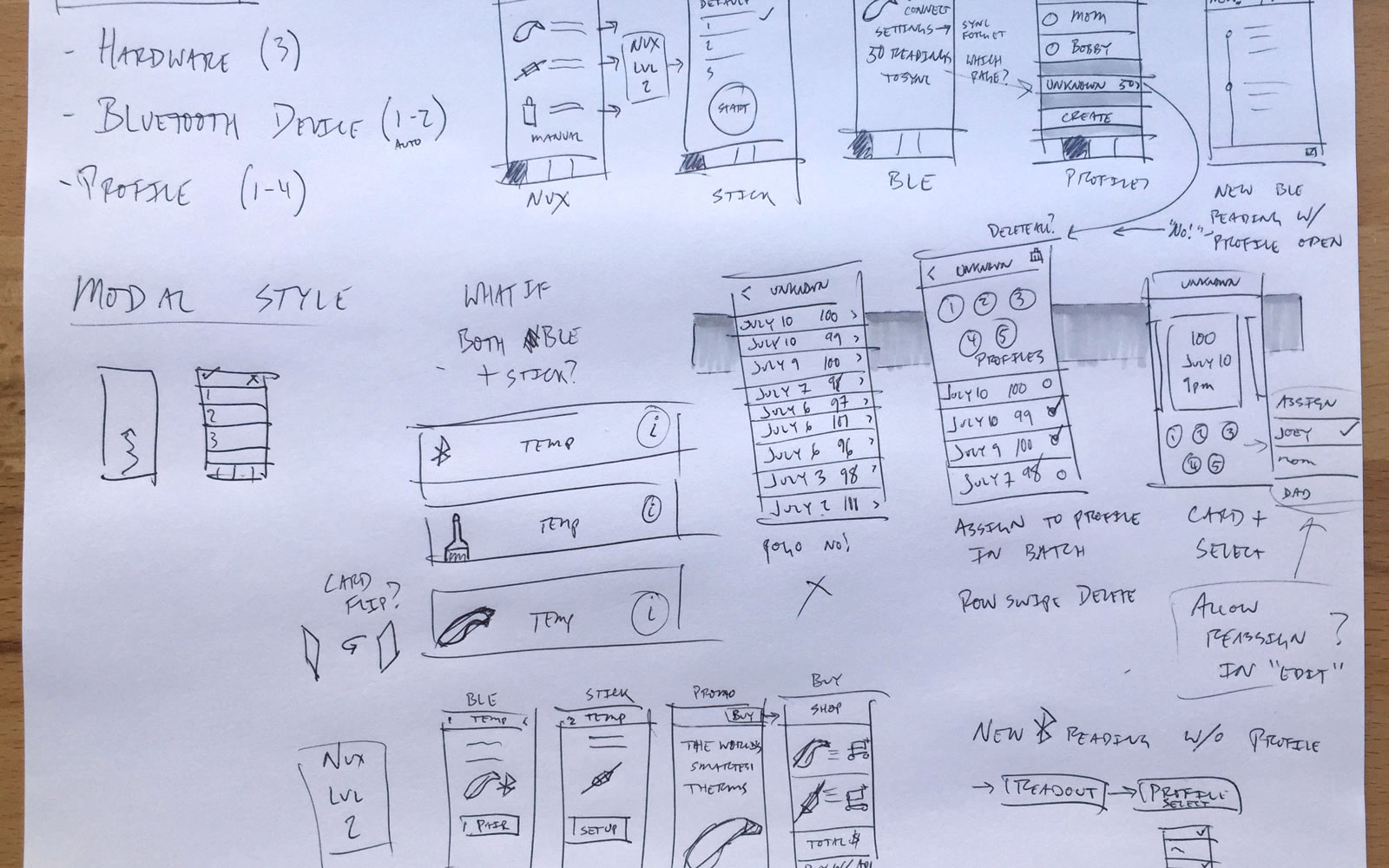
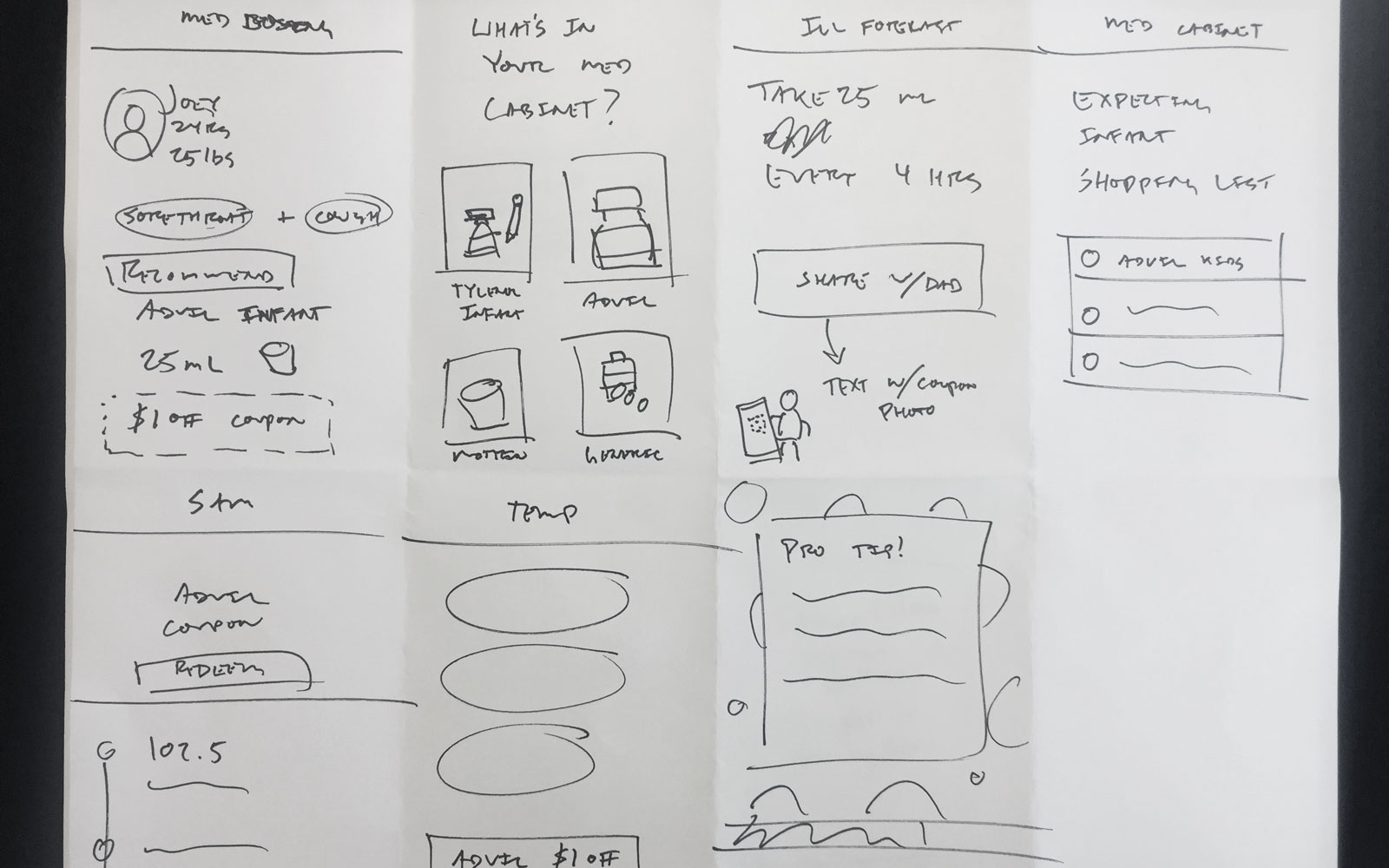
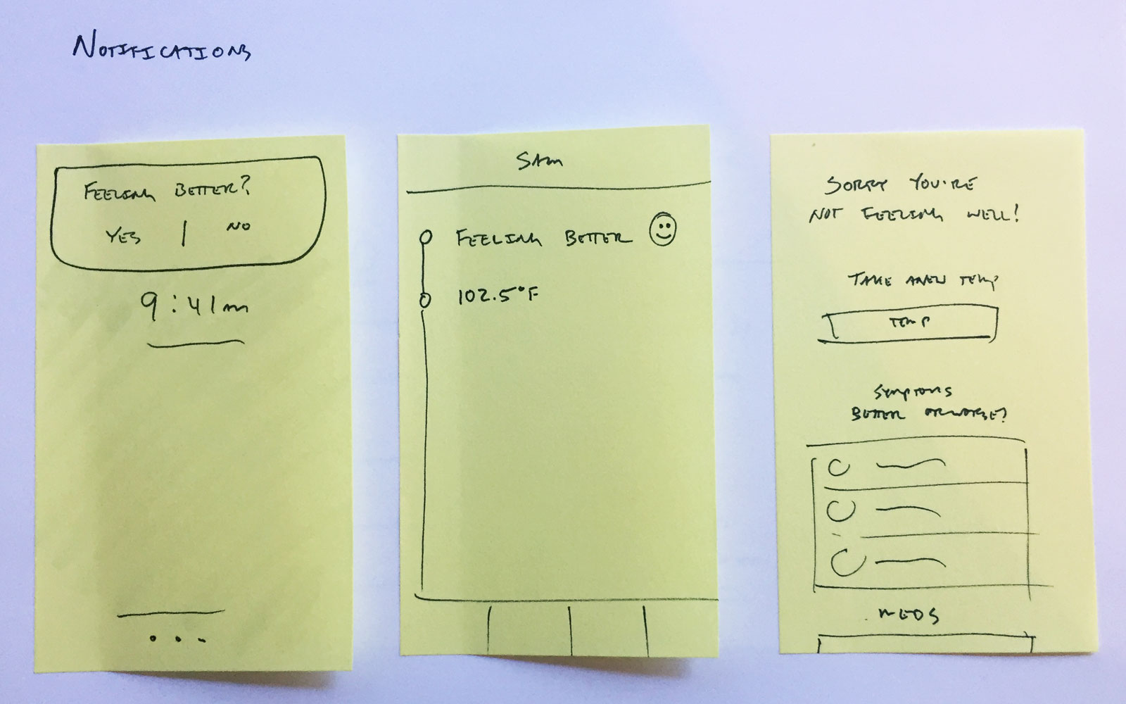
Early sketches
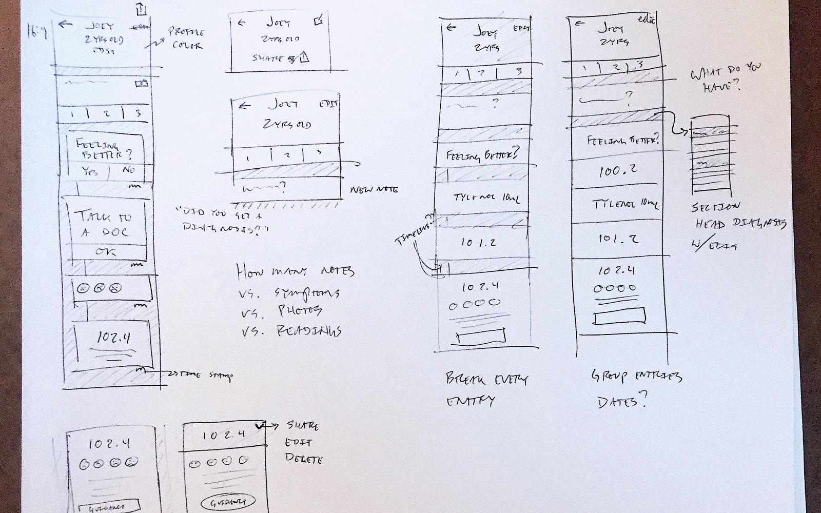
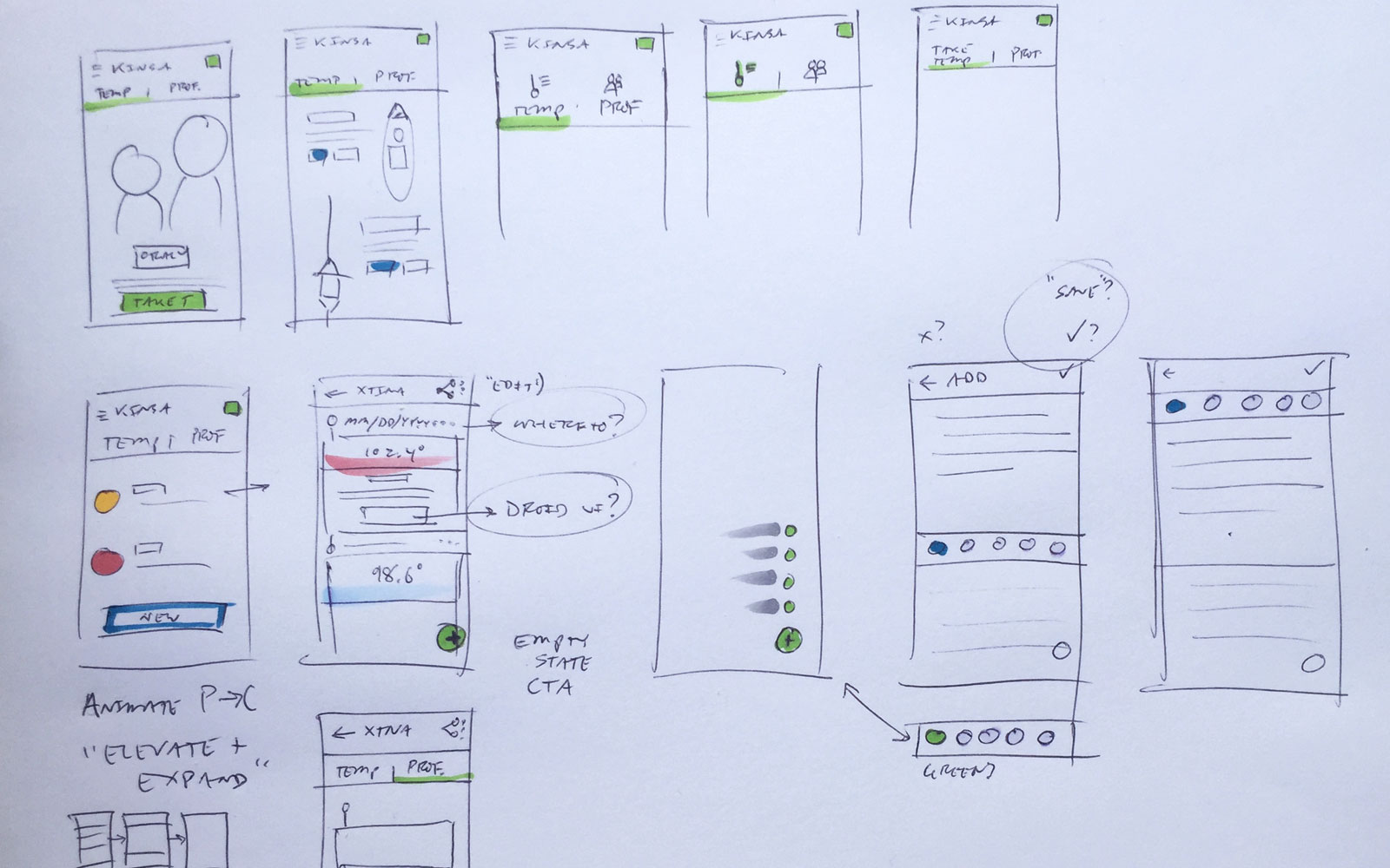
As concepts solidified, I increased the fidelity of sketches and mockups.
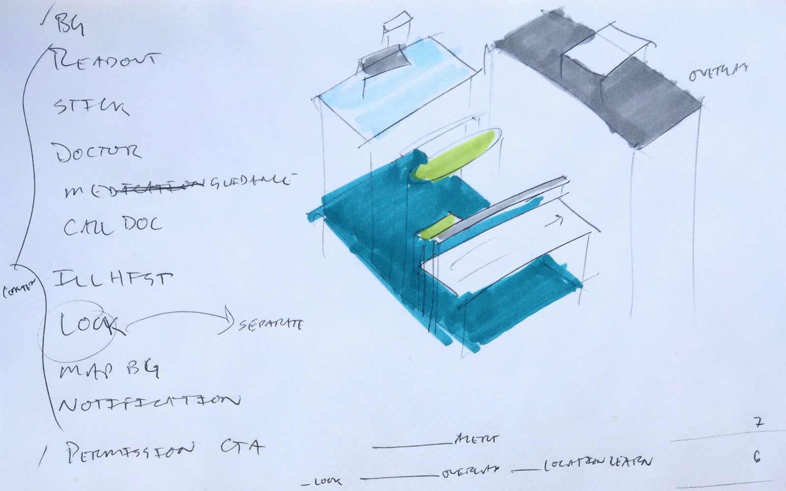
Exploded view of temperature taking I drew with the engineering team.
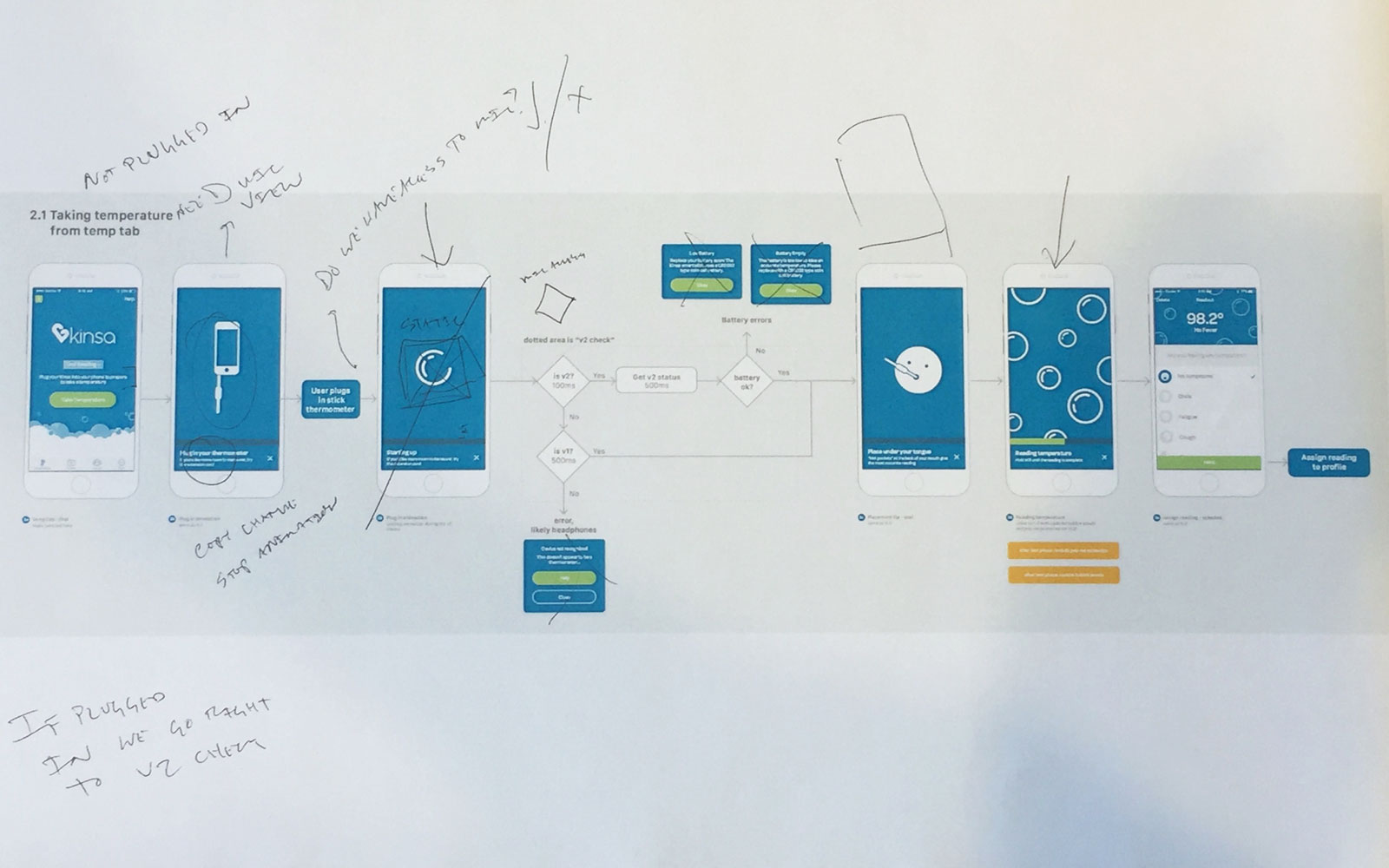
Flows laid out to discuss and get notes from the team.
Interactive prototypes like this one increased the realism for user testing and clarified design intent within the team. I personally prefer Framer for animation details and Invision for quickly testing flows.
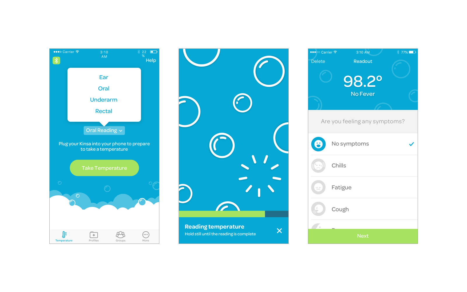
We launched with a nice update to our core temperature taking flow, a tab navigation — updated from a hamburger menu — and the start of our pattern library.
We made a few compromises on the pattern library to shorten the timeline to first launch. We made use of stock iOS components like these list views but set the foundation for gradual improvements down the line.
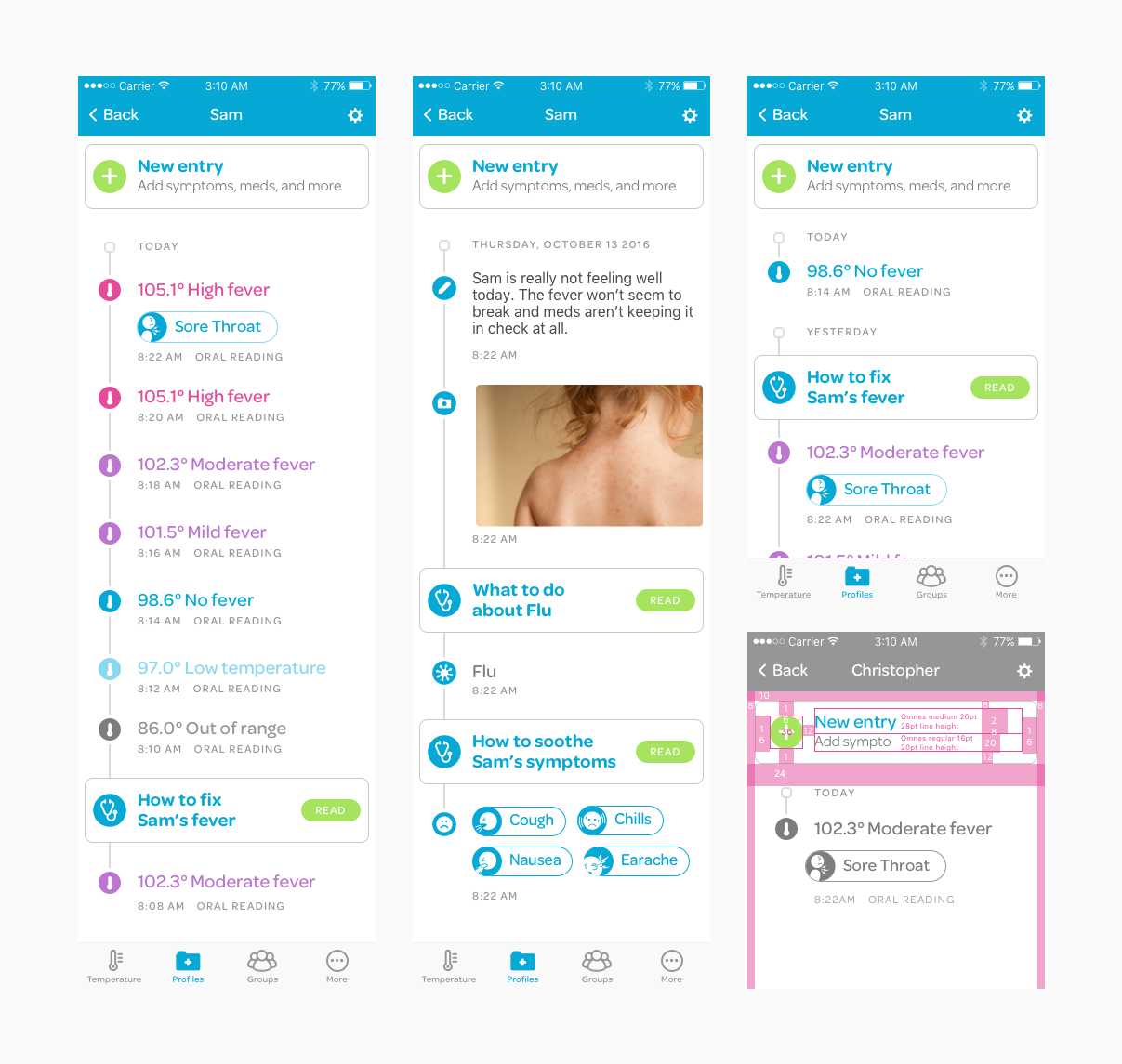
After our initial release, I worked on tightening up UI like the illness history tab.
Designing the process
Weary of the big rewrite, we stepped back to consider our process. I talked with engineering, QA, and product teams and force ranked their feedback.
It was clear we needed to set up smaller projects but this also uncovered a key insight about the order of our workflow: project briefs were too concrete by the time engineering saw it for the first time. I lobbied for and successfully instituted design sprints early in our workflow to get the interdisciplinary team creating concepts together. Sprints helped keep design and engineering in sync, reducing unnecessary work.
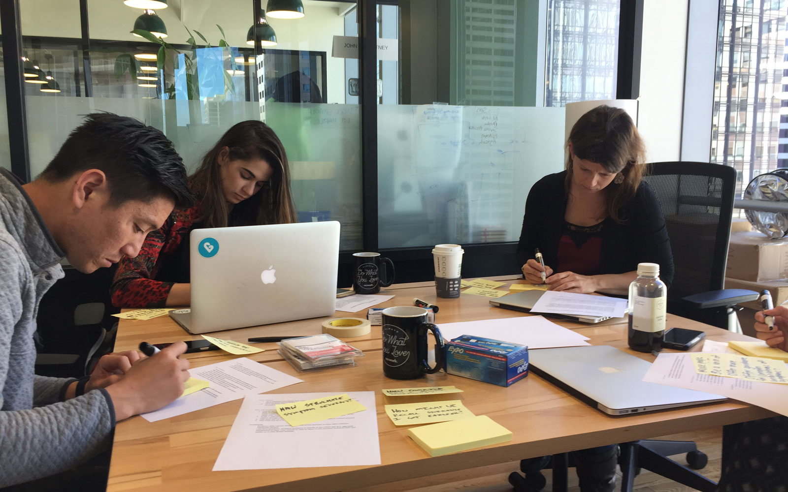
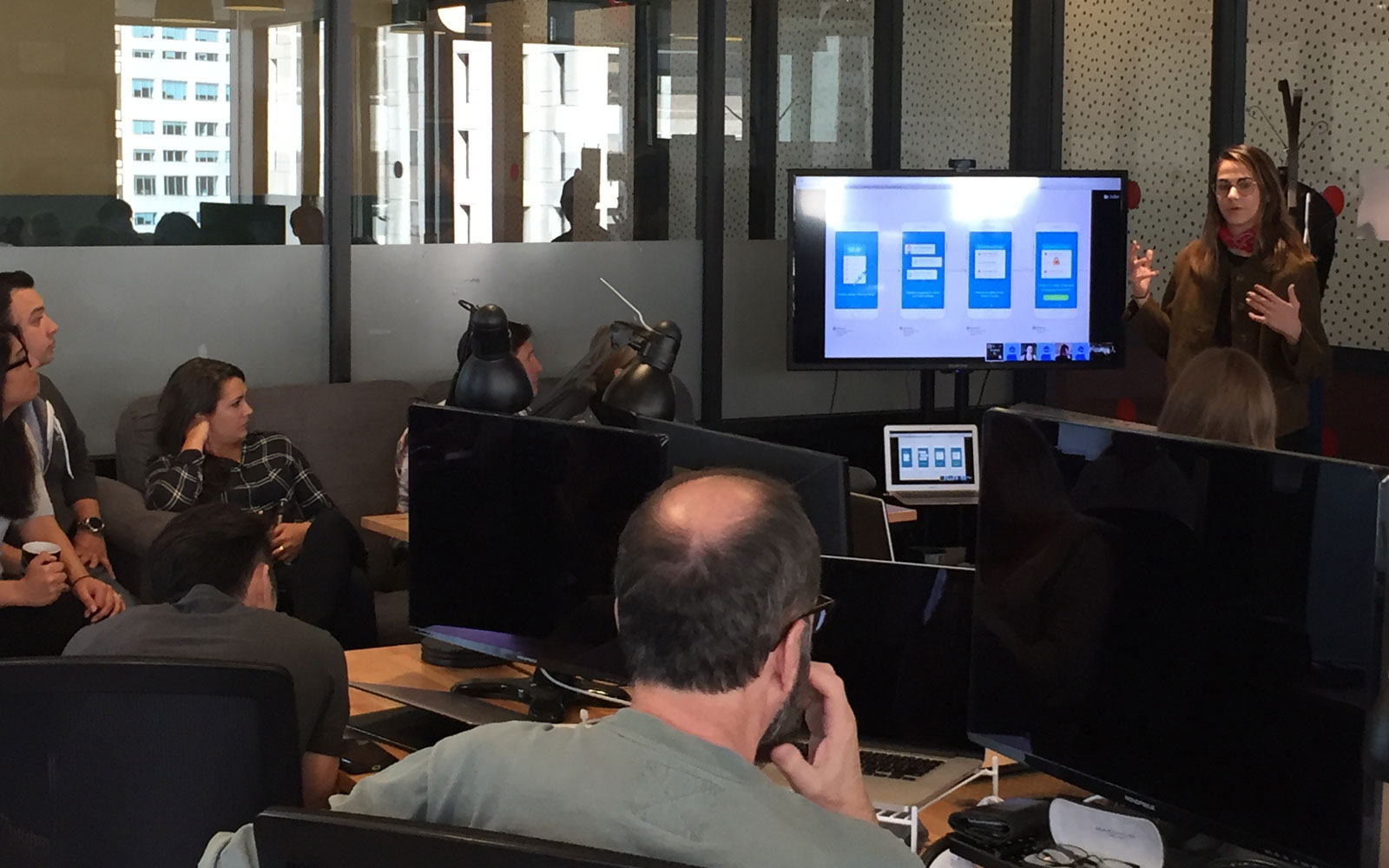
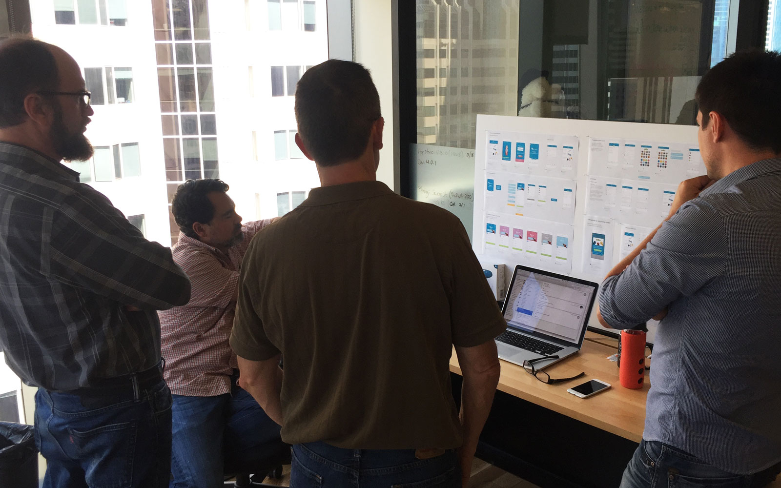
Design sprint with engineering and product folks
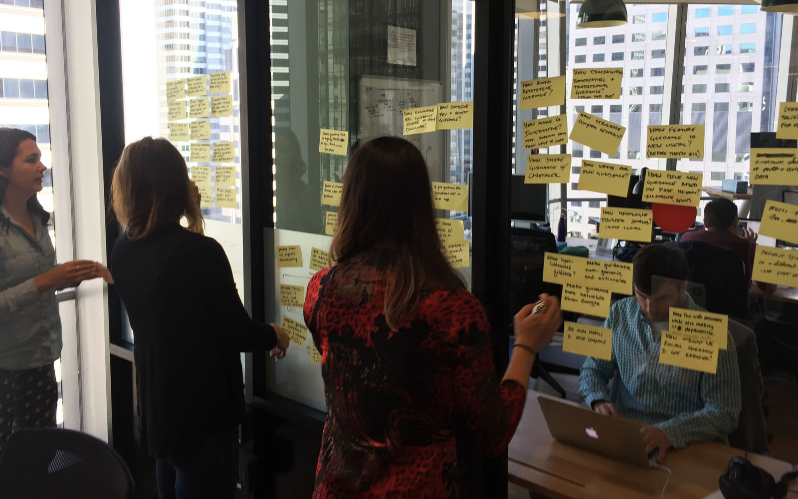
Posting and sorting "How-might-we's"
Crazy 8's
Storyboarding with post-its
A great side effect of design sprints was pinning up more work around the office that led to conversations and faster iteration of concepts.
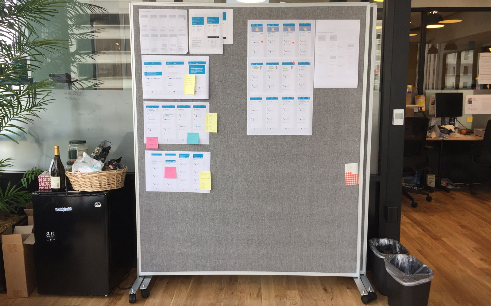
The foam core boards graduated to these pin up boards that roll around the office to foster discussion.
Communicate and adapt
Connected hardware, mobile apps, and an emotionally charged parenting moment made for a complicated product system. Dedication to user research and careful iteration of our design process simplified and focused our efforts allowing us to be successful.